
DrayEasy Mobile App Design
Timeline
May 2023 - Aug 2023
Role
Product Designer
Impact
175% increase of rate search
315% increase of order
(5 months duration after launch)
Skills
UX Design
Wireframe
Prototyping
Intro
DrayEasy is a Digital Drayage Platform that Help Cargo Owners find best drayage price
It had helped move over 26,000 containers and delivered them to more than 5,000 warehouses.
Terminologies
Drayage
Refers to the transportation of goods over a short distance, particularly within the same metropolitan area, or within the vicinity of ports, warehouses, or rail terminals.
Drayage Carrier
Are responsible for providing drayage services. They own or lease the trucks that carry the goods.
The Problem
Users found it hard to access DrayEasy web app while they are on business trips.
If our user want to do rate search when they are traveling, it will take more than 15 minutes using web app since they will have to setup their laptop and network.
Design Scope
We focus on the DrayEasy Mobile App rate search process.
Our client want to build a mobile experience to expand their user base, There is another team working on the Web App redesign at the the same time.
How Might We design a mobile app to help Cargo Owner Complete booking more efficiently and Smoothly ?
Impact
175% Increase of Rate Search Usage
The new design had led to 175% usage increase of the rate search feature over the 5 month.
315% Increase of Order Quantity
The number of orders on DrayEasy platform increased to 315%
Feature Highlight
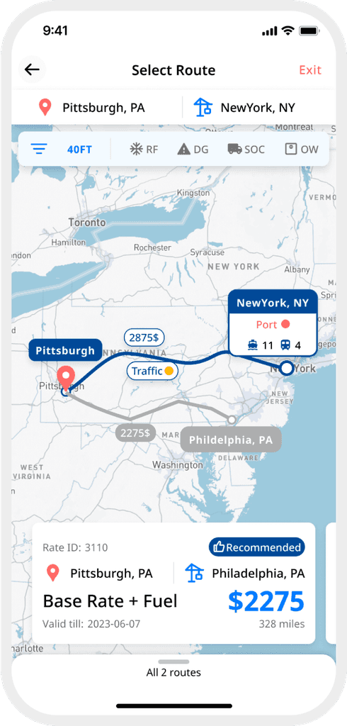
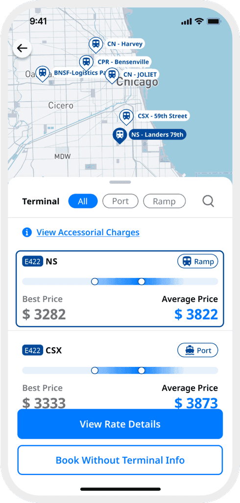
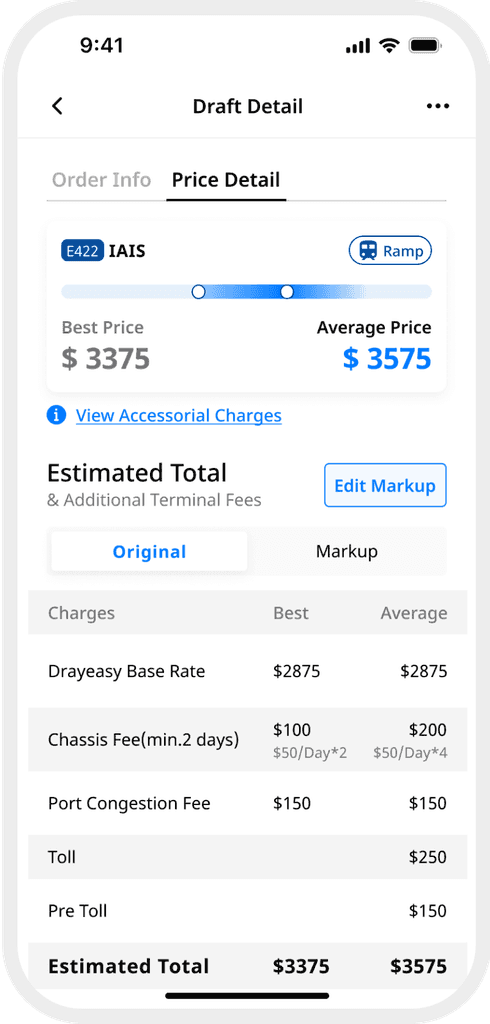
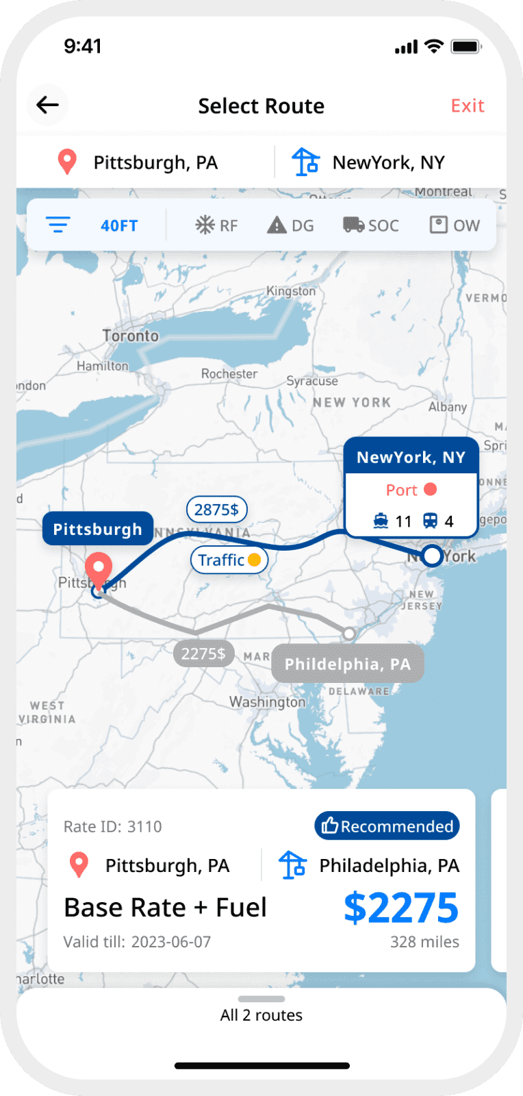
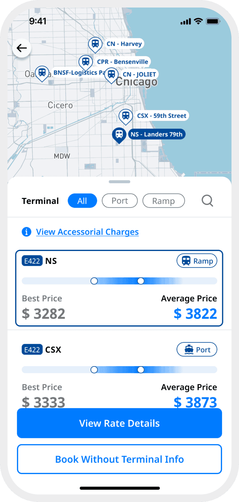
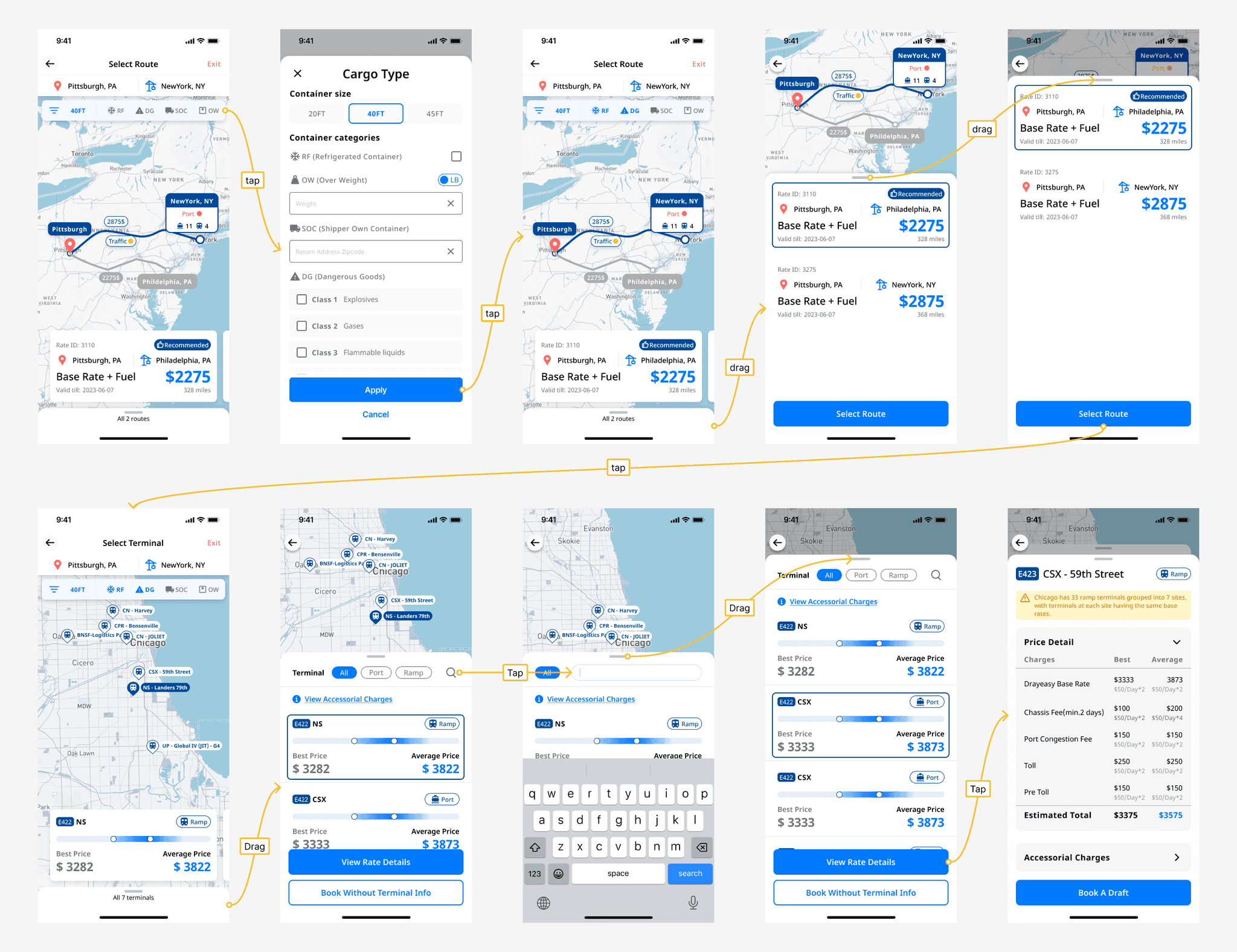
01 Easy Compare
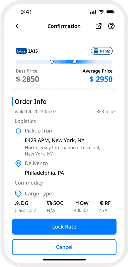
Understand complex options at a glance
A revamped visual and information architecture made previously complex drayage options easier to digest, so that the user can focus on what’s truly relevant to make a choice.
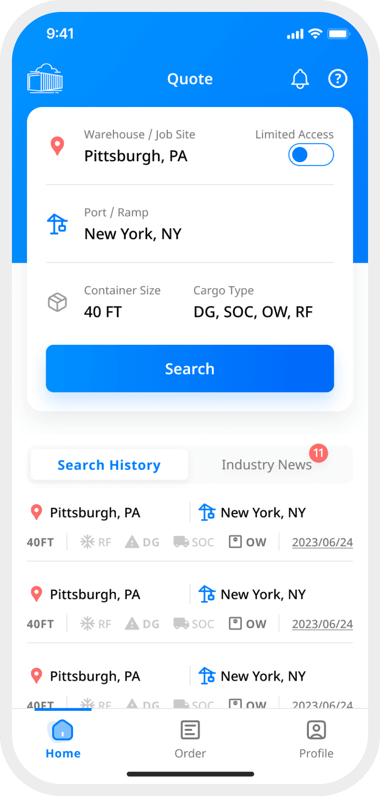
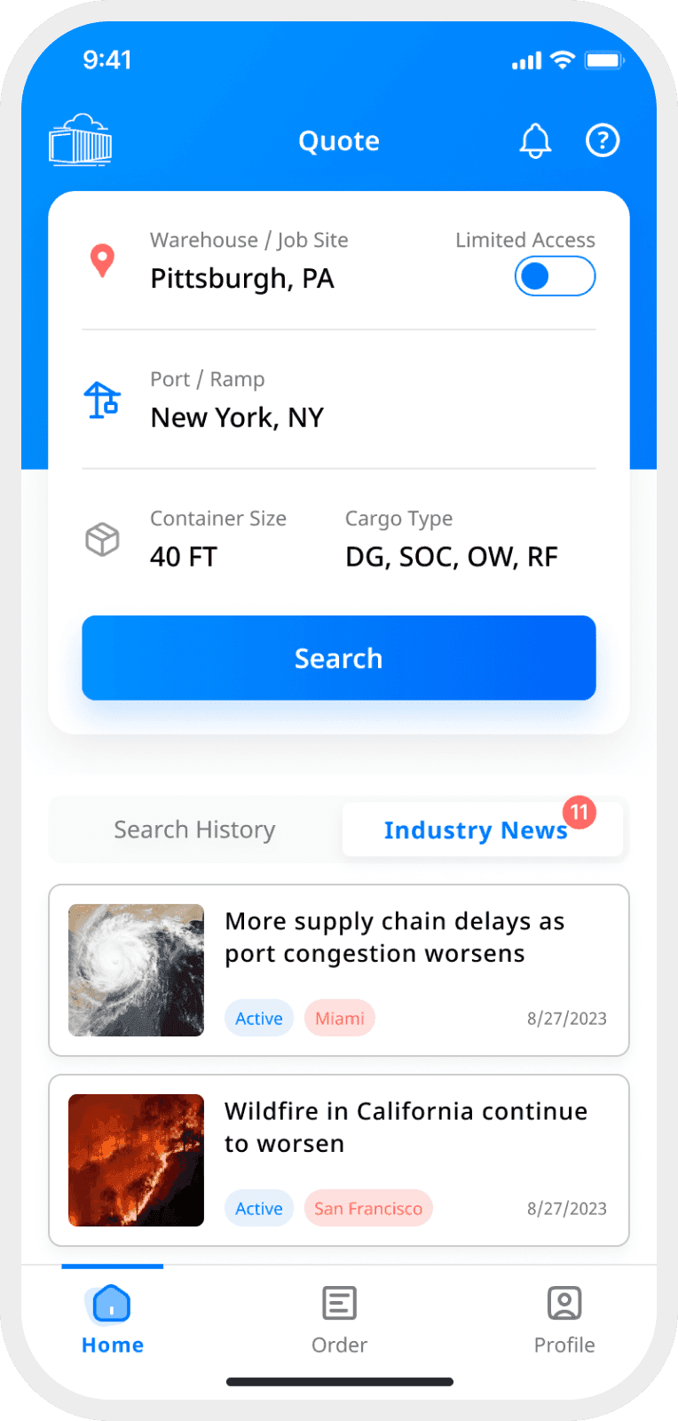
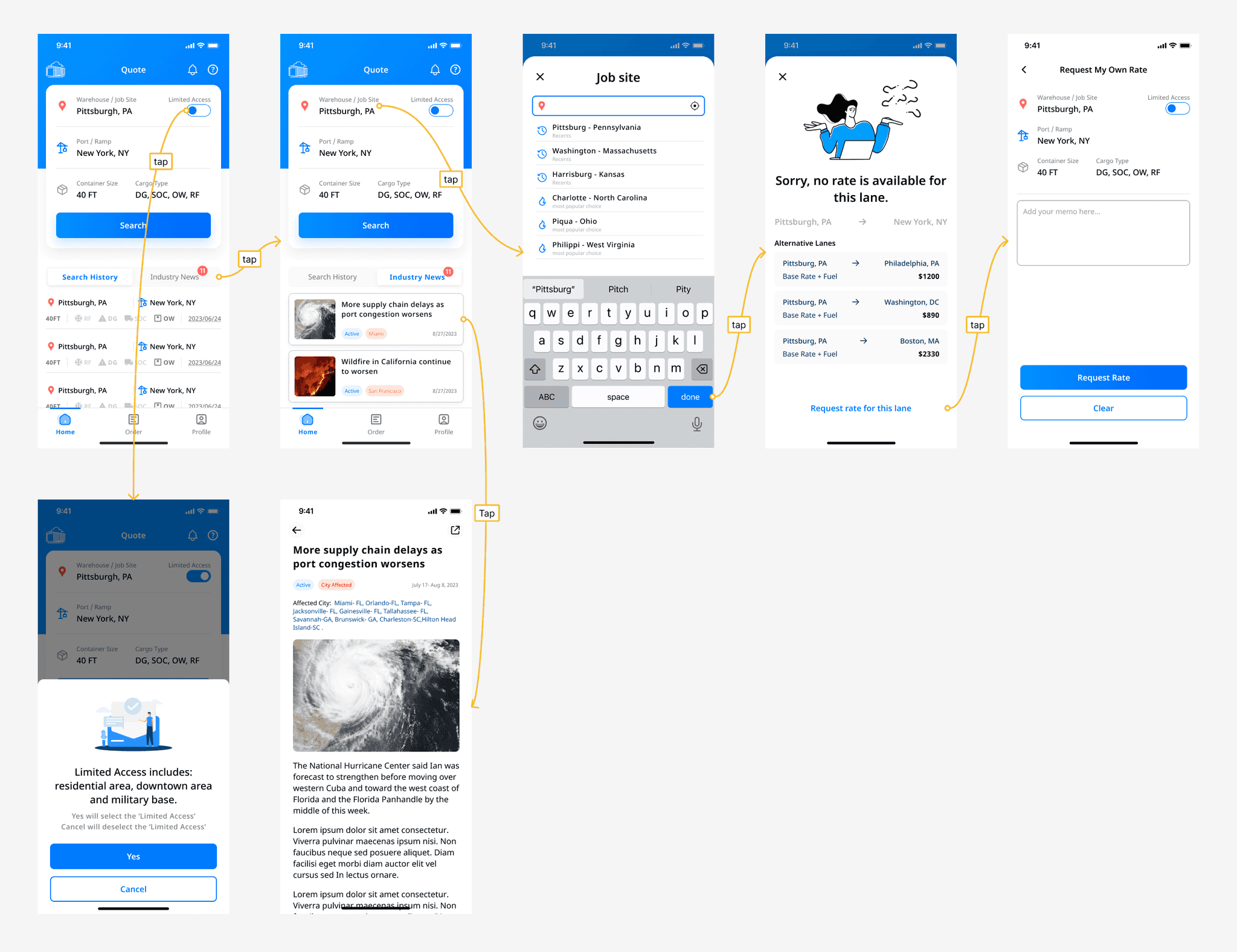
02 Integrated Homepage
Search, browse, and kept posted
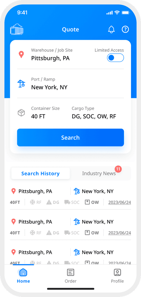
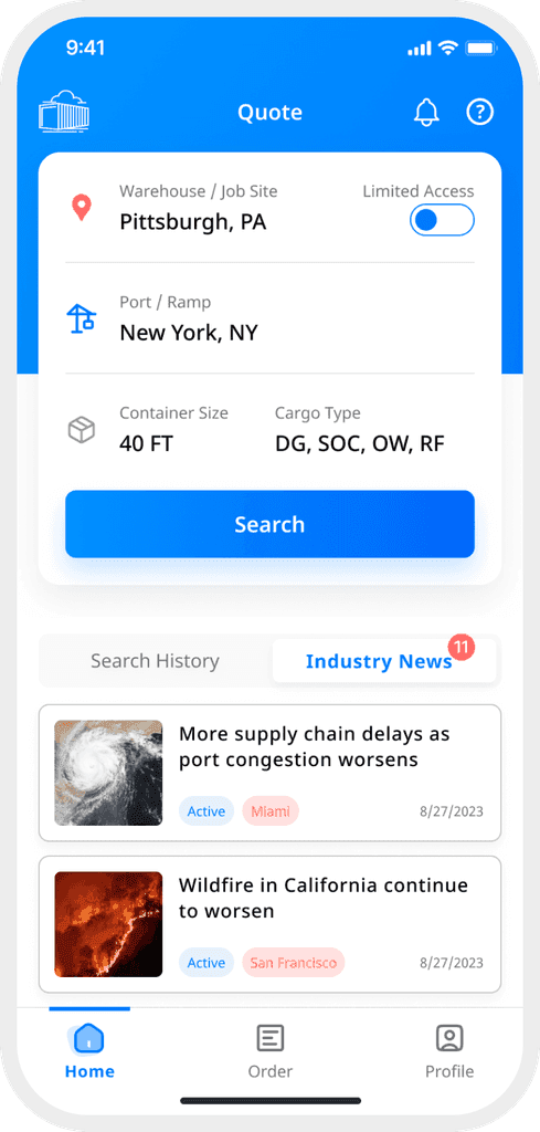
A integrated homepage is compact yet rich in information, allowing the user to search drayage rates, browse search history, get realtime industry news, and receive important updates.
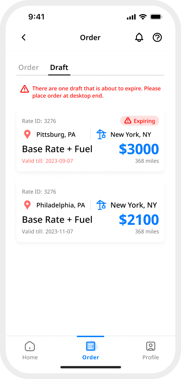
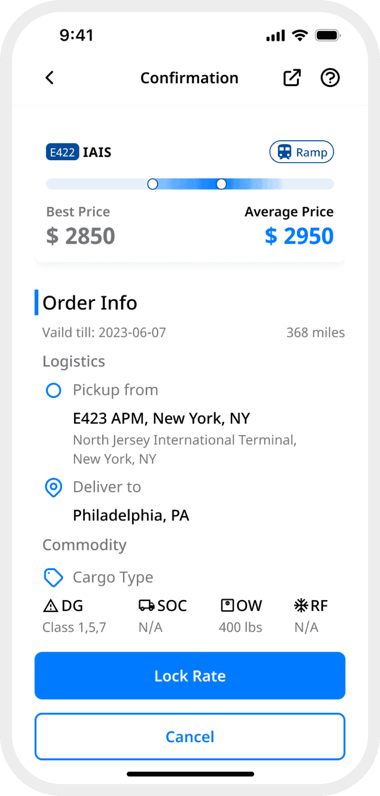
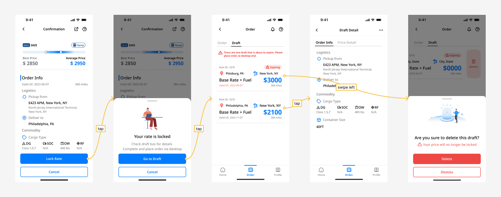
03 Book a Draft
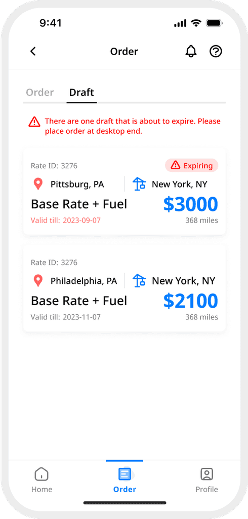
Leave tedious typing to the desktop
Manually type in container informations on mobile can be painful. Book a draft feature can help our user leave the typing to the desktop.
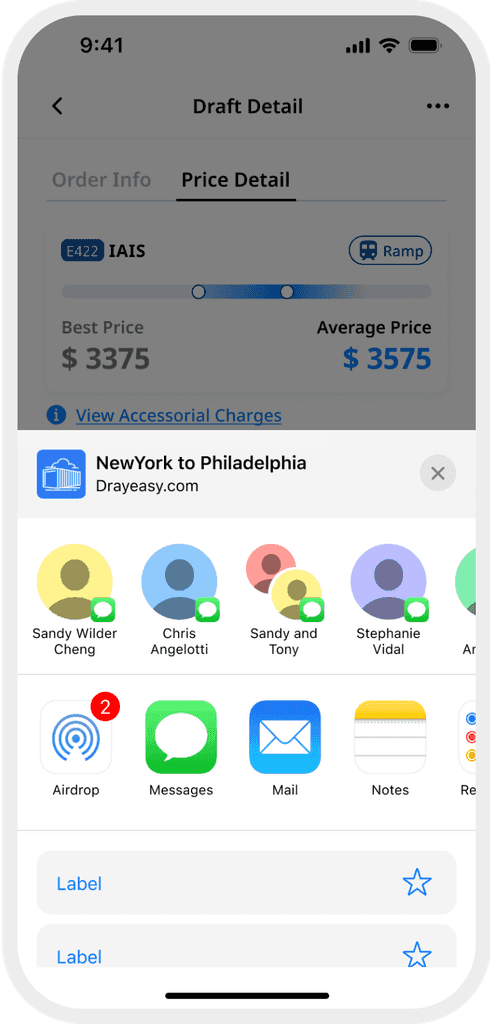
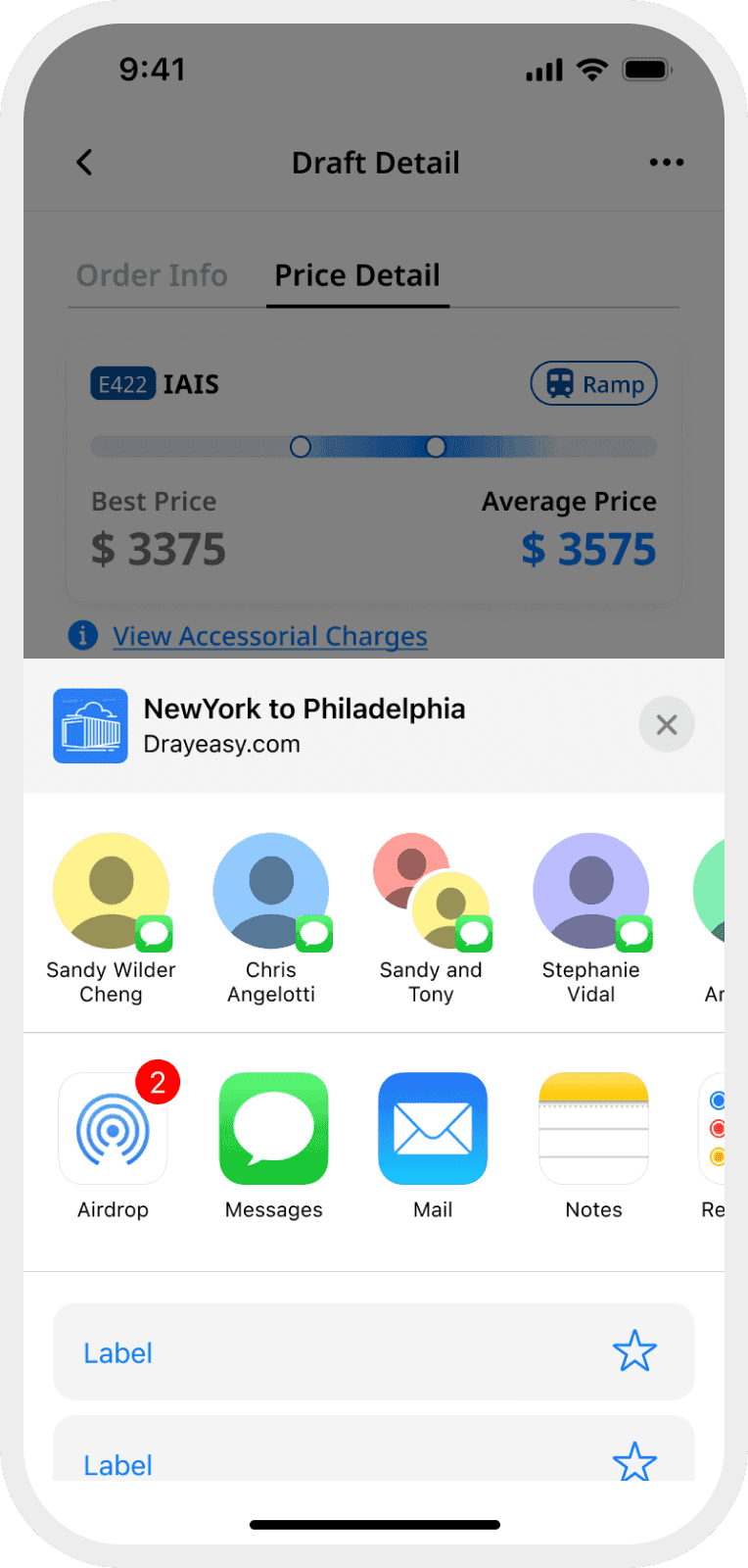
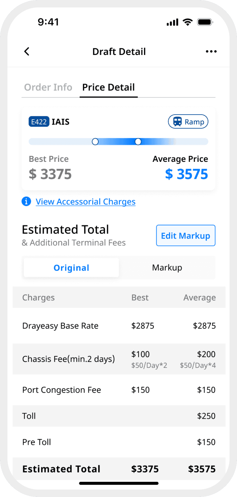
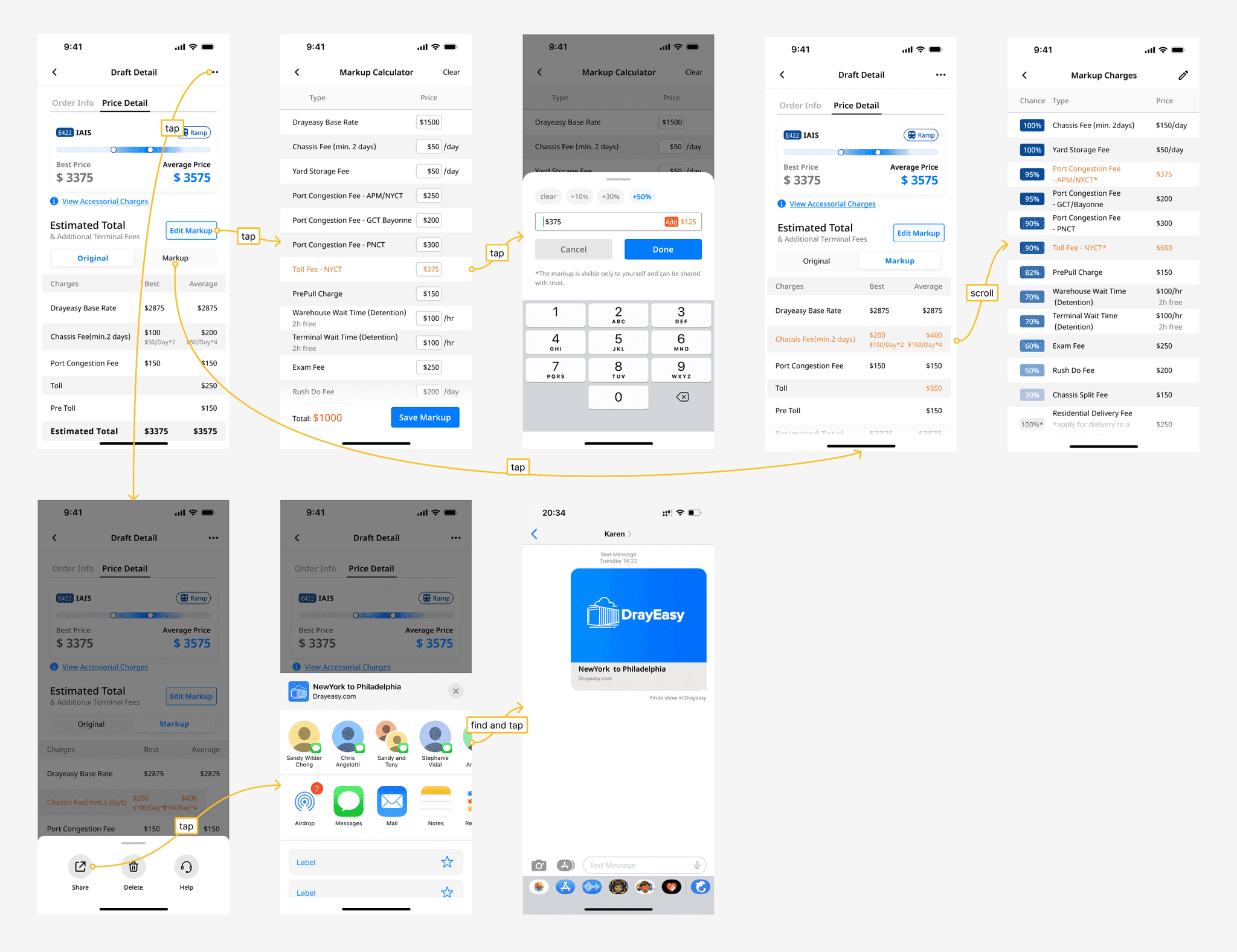
04 Share Rate Search Results
No more screenshot or copypasting
Our users need to communication with their clients about drayage options frequently, we designed a sharing so they don’t have to do a screenshot or copy and pasting manually.
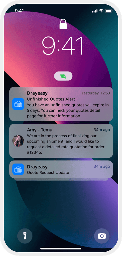
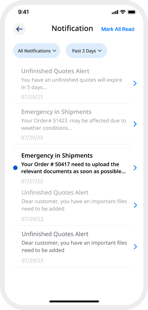
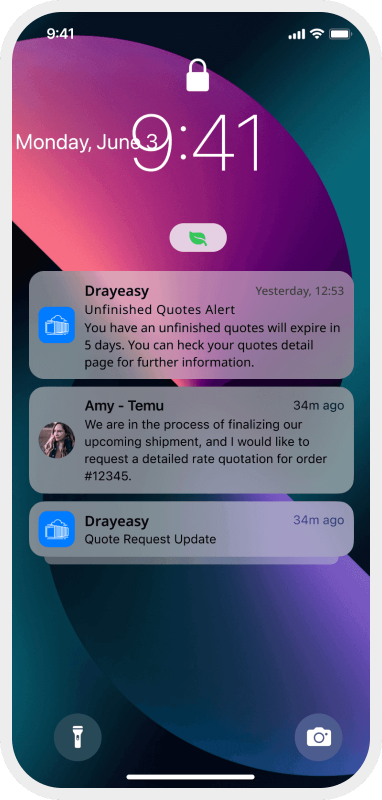
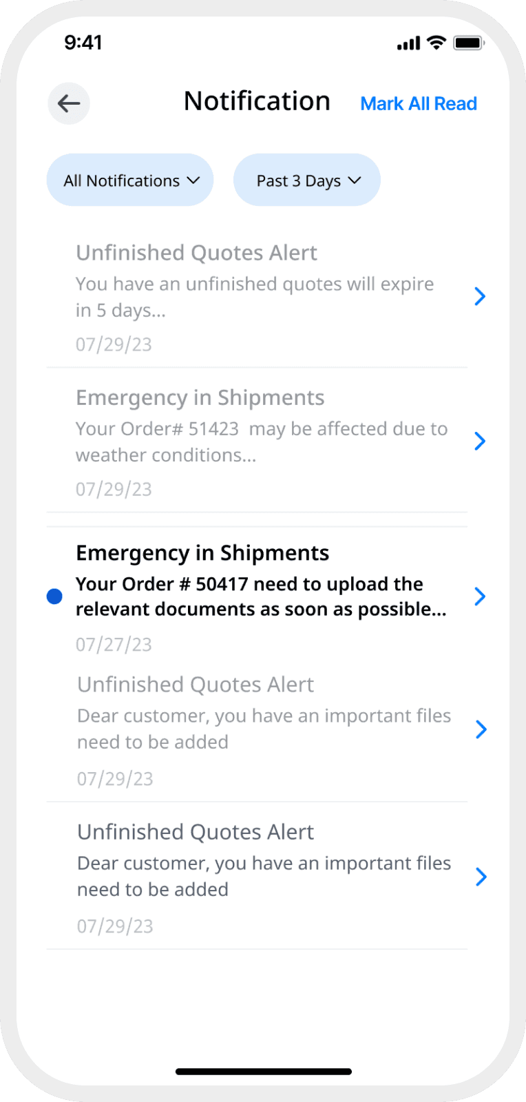
05 Notification
Never miss out
To fully utilize the features of mobile platform, we designed system push notifications, and a integrated notification center in the app to keep our users updated and never miss out a important information.
Final Design
Research
Issues of the Original Website
To start with, we analyzed the current website design to identify existing problems
Competitive Analysis
Take aways:
- Improving the user experiences by breaking down a long process into several short steps.
- Mobile notification is especially useful to keep users updated
- The mobile app has a limitation on data inputs. Simplify user operations and processes.





Research: Expert Interview
Identify user painpoints
Solve web pain points and better collaborate through mobile design
Understand users need
List user feedbacks and determine mobile information architecture
Get insight on use cases
Re-optimize mobile workflows to provide a user-friendly experience
Understanding our user
Pain Points
Previous Web App Flow
We mapped out steps needed to complete a drayage book based on website and previous analysis.
Redesigned Mobile Flow
We designed a book as draft feature to avoid excessive typing, and combined search and notification in one page to streamline the booking experience.
Redesigned Flow
Design & Iteration
Web to Mobile
Web
Too much information to fit in mobile screen.
The map takes up too much space, layout tweak is needed.
Website does not allow instant ‘Industry News’ checking.
Mobile
Reducing user cognitive load and allowed for a more intuitive navigation.
Replace the map with search for a more informative homepage. layout tweaked to better fit vertical layout.
Feature Addition: Introduced a 'News' feature to keep users informed.
Industry News
Iteration 1
Two way scroll is not intuitive
“History” is more important than industry news (Based on Usability Testing)
Final Pick
Use tabs to switch between “Search History” & “Industry News”.
More news details put to a secondary page.
Search & History
Iteration 1
layout of history info is confusing.
Need additional info of order history (Based on usability Testing and feedback)
Iteration 2
Too many filter options causes distraction.
Chaotic visual hierarchy causes confusion.
Final Pick
Reorganized layout + visual hierarchy to avoid distraction
Compact yet easy to read order history allowing more details to be shown.
What matters first
We did a Four Quadrants analysis to figure out what and how the notification should be presented to the user.
Notification
Iteration 1
Lack of clear information hierarchy
Iteration 2
Color as a single indicator for multiple property of notification. not intuitive enough
Final pick
Adding category tab for clearer information organization.
"Action" and "Acknowledge" tag indicates whether user action is needed
Compare
Iteration 1
Map showing along side rate information is crucial for users as most of them are not familiar with US cities.
Multiple price information increases user cognitive load
Iteration 2
Incomplete route information, and can’t distinguish “Job Site” with “Terminal”.
Inefficient “City Card” layout. Lack of visual hierarchy.
Final Pick
Additional route information on map for easier route compare
Clearer and more organized price card design
Filter & Search Bar Layout Iteration
Iteration 1
Cargo type is rarely used
Complex to develop
Iteration 2
Complex visual
Clickable area too close
Final Pick
Clean and organized visual
more distance between clickable areas
Filter Card Iteration
Based on previous user feedback, we decided to combine different options in one filter popup card because those filter property are rarely used. It's also easier to develop improves consistency across the app.
Iteration 1
Two way scroll too complex
Had to adjust input field when Keyboard showed up
Final Pick
Simper interaction and hierarchy
Adjusted input field sequence to avoid missing a field
Reflection
Edge Cases
Different Cities and ports can very different and it is hard to imagine every cases without data insights and usability testing, therefore difficult to prevent errors from edge cases. If we can get more information on the database, we can optimize user experience based using a data driven approach.
Information Management
Due to mobile’s vertical & narrow shape, information might turns out too overwhelming when transferring web page to mobile app. Building a hierarchy and breaking down pages would be fairly efficient when displaying different level of info.
User Centric
Mixing various methods of layout can help covering more info. However, after usability test with mobile, users said: “ mixing layout methods are not intuitive, and might not be friendly to green hands”.